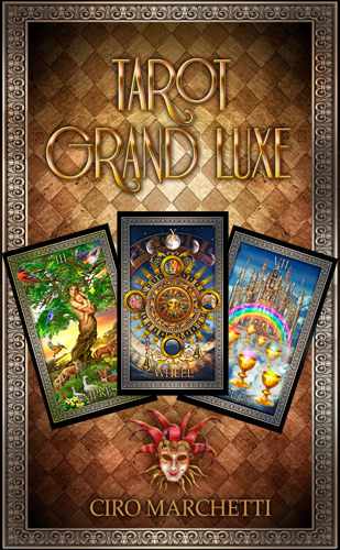
Tarot Grand Luxe
by Ciro Marchetti
|
|
|
|
|
|
|
Also available in our Tarot & Numerology App for Apple iOS & Android
 |
The Tarot Grand Luxe is my latest tarot deck project. This special edition is self published and geared principally to collectors. I am assuming that anyone reading this is already reasonably familiar with Tarot and specifically with the Rider Waite Smith deck upon which the images of this project are, for the most part, based. So, it would be somewhat redundant to provide yet another companion book or document that explains the historical content and meaning, behind each image of each card. Many cards of this deck are in familiar enough territory relative to the RWS, that I don't think further explanation is necessary. Nevertheless, as I have deviated to some degree from those traditional core images, this document is a brief summary to offer some insight into my personal ideas and objectives. Depending on the card, this may constitute several lines, in others merely a summary of keywords. I would emphasize, however, that these are only my personal ideas and views, and ones with which you may not fully concur. But should that be the case, hopefully, the images themselves will still offer a flexibility of interpretation that you can work with.
To provide some initial context, we must acknowledge the obvious, namely that the pen and ink illustrations of Pamela Colman Smith and the earlier Tarot de Marseilles woodcuts that preceded them, between them, represent the visual foundations upon which the general Tarot genre is built. They serve not just as the core sources of tarot traditions but in the opinion of many, are infused with aesthetic artistic merits along with religious, spiritual, political and esoteric symbolism. While you can't negate the importance of these earlier deck images, I do question some of what has been subsequently written and concluded from them over the centuries that followed. The reality (in my view) is that in many cases, the illustrative styles of these earlier decks do not provide sufficient definition to clearly portray much of what has been ascribed to them. So much of what has been written about them is, in my mind, simply conjecture; influenced by varying perspectives, such as moral and social values that changed over time and geographical regions. Not to mention the egos, personal beliefs, and agendas of the individual authors along the way. The results are a veritable potpourri of interpretations, ranging from well researched conclusions to imaginative but less credible theories. Nevertheless, despite the inconsistency between them, many have gained varying degrees of traction and credibility from their respective followers, if only because of the constant re-telling and reconfirmation over time. But, in the absence of any concrete historical origin that can be referenced to serve as the definitive correct intended meaning behind those early images, we are left with a rather inconclusive scenario where Tarot imagery remains somewhat of an enigma.
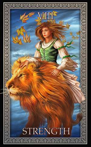
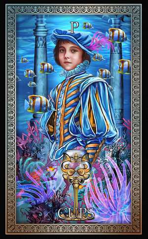
As a designer, this is both a dilemma and an opportunity. One can choose to follow tradition faithfully, as many do, accurately reproducing the composition, color and line work of those earlier decks. This approach seems to be popular even today with numerous (accurate) reworkings of the older decks. This is to be applauded as some are quite beautiful and certainly meet with the approval of the more traditional members of the tarot community. But, such an exercise while representing a technical challenge of sorts, creatively is one that offers little interest to me. Furthermore, I cannot deny that in many cases I simply do not see, in those early images, what others claim to see. The actions, gestures, expressions, etc, of the various characters occupying those cards, are simply not depicted clearly enough to support all the interpretations that have been subsequently associated with them. Furthermore, I am simply not convinced that every detail within any given composition was deliberately included with symbolic intent. A flower, animal or ray of light might, in some cases, may simply have been decorative content. But, even if such elements were intentionally symbolic, that symbolism might not have served cross culturally. In many cases, I feel that people see form and function not because it's there, but as a result of it having been pointed out and suggested to them as such. I know this to certainly be the case in my own work where, for example, people have often attributed meaning to some feature, even negative space, that may coincidentally resemble some other form. While it would be tempting in these cases to take credit for such "clever" visual play and claim it to have been deliberate, I can't, in all honesty, do so. I refer to this phenomena as the "poodle in the cloud." What is fundamentally a random shape, once pointed out as resembling the form of a poodle, can often elicit an "ah, I see it now" response from others. A phenomena that has occasionally proved extremely profitable, when for example a slice of bread randomly toasted and resembling the form (allegedly) of the Virgin Mary has been auctioned for large sums of money on Ebay. But, back to Tarot where this ambiguity serves a positive role. The "poodle in the sky" is the very feature that allows the lesser illustrated patterned designs of the Marseilles suites, to be read intuitively, where the interplay of shape and form offers infinite possibilities of interpretation. To a similar, albeit lesser degree, the pen and ink illustrations of Pamela Colman are not particularly detailed but can be treated in a similar manner; her illustrations, clearly loved by many, and the importance of her role in Tarot's history beyond question. But at the risk of offending many in the tarot community (which I often do), I have to say that for me personally, her style and composition is not one that provides me with clarity. Body proportions, poses, expressions, the direction of pointing fingers etc are, by comparison to her illustrator peers of that same historic period, are lacking in terms of the draftsmanship and detail required to provide a clear narrative of the scene. I say this not as a critique but, to highlight once again its benefits, in that it provides flexibility of interpretation. I cannot emphasize how important I consider that to be. If tarot did have a definitive historical basis, and if in the imagery of each card there was a clear depiction of it, and their meaning universally accepted, the result would be a rather rigid inflexible set of images, that would offer far less room for intuitive input. Whereas, the vagueness I'm referring to, and for all the reasons I've mentioned, is actually tarot's strength. Namely a combination of relative structure and basics but one that is still malleable, one that can be molded by the reader to best reflect the nuances and circumstances of an individual reading. My approach has been to produce imagery that is relatively familiar to the same corresponding cards from earlier decks and maintains that same ambiguity, but with a more detailed illustrative style and occasional personal visual twist.
Process
In terms of technique, my medium of choice is "digital." In recent years, there seems to be an ever increasing production of tarot decks, in part because of this new medium; one which allows for the use of direct photography or at least manipulated photographic sources. This might suggest a "relative" ease and speed, but as with all mediums, there are variations in how it's used and the final product. Art is subjective, its quality should not be judged by the time it takes to produce. Nevertheless, for those who are interested in such things, my process involves very simple initial sketches that serve as a starting point for composition and theme. These almost always get changed along the way to the final image, but they serve as a base from which to then search for usable reference material. In the case of faces, I often combine multiple sources, selecting references of mouths, eyes, hair from different faces, which I then mix, match, distort and warp to create new ones. Same for background, landscapes skies etc. These are then combined with my own illustrated elements, all manipulated further to create a common visual consistency. The process continues with numerous minor manipulations, for example adding light and shadow so that the various elements acknowledge and respond in a credible manner to imaginary light sources. While much of the base material may have originally been photographic, the end result is fully reworked, digitally painted, using a tablet and pressure sensitive pen. Last but not least, in this Grand Luxe, I have added a final stage that deliberately diffuses the crisp detail, typical of many photo or digital decks and produces a more brush/paint texture. All in all a labor intensive process that represents around 20 hours per card. For those technically familiar with Photoshop, many cards utilized over 80 layers.
Ciro Marchetti reimagines tarot by presenting vivid dream images that map out a fascinating journey of self-discovery. Tarot of Dreams explores the profound web of visual and emotional associations that occur at the intersection of divination and dreams. Tarot of Dreams offers readers a powerful tool for personal insight and divination.
Ciro Marchetti is an award-winning digital artist. His popular decks include Gilded Reverie Lenormand and Oracle of Visions.
About Ciro:
Some years ago I turned my back on my career in corporate graphic design. I sold my company and dedicated my efforts, full time, to personal illustrations. A large portion of my work, during this period, has been the production of decks of tarot and oracle cards. The mystical historical context of this genre sparked my curiosity and subsequently seemed suited to the overall look and theme of other images I was producing. While I make no claim of being a tarot reader, I found it an appealing challenge to create images that tarot readers might connect with. Following the year of their individual release, each of my six decks was voted "most popular deck of the year," by one or more of the leading tarot community groups.
So I guess I must have got something right.
My general illustrative work is represented by MGL Licensing Graphics, based in London.
More recently, I have been playing around with animated sequences of my images. The addition of movement and music, combine to create a truly powerful extra dimension of story telling.
AWARDS
MacWorld Digital Art Competition winner 2001, 2002, 2003 & 2005.
Five GURU Awards from (NAPP) the National Association of Photoshop Professionals.
Artistic category and Best of Show 2001, 2003 & 2006.
Worldwide Digital Canvas Award 2006 - Artistic category.
Worldwide Photoshop Award 2007 - Artistic category.
Worldwide Photoshop competition 2009 - Grand Prize Winner.